
The Indicator Lab is now open. It's a membership for running investigations with AI, your agents do the legwork and leave the judgment to you.
I've had my head down packaging the tools into a desktop app for Mac and Windows, so they're easy to install and stay up to date. You can run any of the integrations from your preferred AI desktop app, or locally on a machine with 24GB of RAM. The installer includes:
- OSINT Navigator to find the right tool for a lead among more than 13,000
- Spotlight to run the investigation, stopping for your sign-off at each stage and linking every claim to its source
- Scoutpost to watch pages, profiles, planes and ships, and flag what changes
- Mycroft, one workspace for all of it, locally if you want
- and now Splash, for charts, maps and video (more below)

Every month there's a live Lab Workshop, followed by a Lab Notes issue. Office hours every two weeks are to discuss any issues you're seeing, the challenges you're working on or the workflows you're building. A self-paced course for members is also on the way.
Paid Indicator members can add it for $10 a month. If you're new to Indicator, it's $22.95 a month with membership included.
The stack
Splash
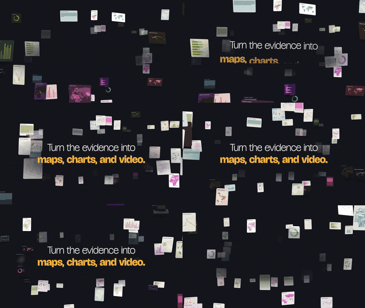
Splash is out in public beta. It's an open-source tool that turns your reporting into charts, maps and video from inside your AI assistant.
Small newsrooms rarely have a graphics desk, and readers can't be expected to dig through a wall of text for the one line or statistic that changes the story. Splash installs as a set of skills in your AI assistant and does the graphics work with you.
Give it a story and its data and it will:
- help you pin down the one message your data can support
- draw on graphics research to help you choose the form that shows it most clearly, from 44 chart, map and scrollytelling types
- tell you when the data won't hold the one you asked for
- build a draft for you to review
- produce static graphics for print or interactive ones for the web
- turn a graphic into a video for social media
Rémy and I built it with funding from the Innovationsfonds für multimedialen Journalismus (IMJ), so that newsrooms without a graphics desk can make visuals too. Thanks to Yvan Pandele and Heidi.news, our partner newsroom, for piloting it: the first Splash graphics ran in their reporting.
|
Sponsored by

This issue is sponsored by MapTiler, the technology provider behind every map in my videos and in Splash. I use it for everything from interactive data maps to animating cameras through 3D terrain.
I love that it works across tools like QGIS and Unreal and libraries like deck.gl. Connect a free account to Splash and start building your own animated maps.
|
Decoded
Who has the compute
Stripe published a set of charts on entrepreneurship in Europe vs the US. The data centre capacity by country is pretty wild, read off the bars, the US has about 32 gigawatts running today and roughly 70 more in the pipeline. In the chart, that looks like every other country combined, China included (which is either surprising or false). Germany, France, Ireland and the Netherlands each run around one gigawatt today.
If you're in Europe and care about sovereignty, this is a problem.
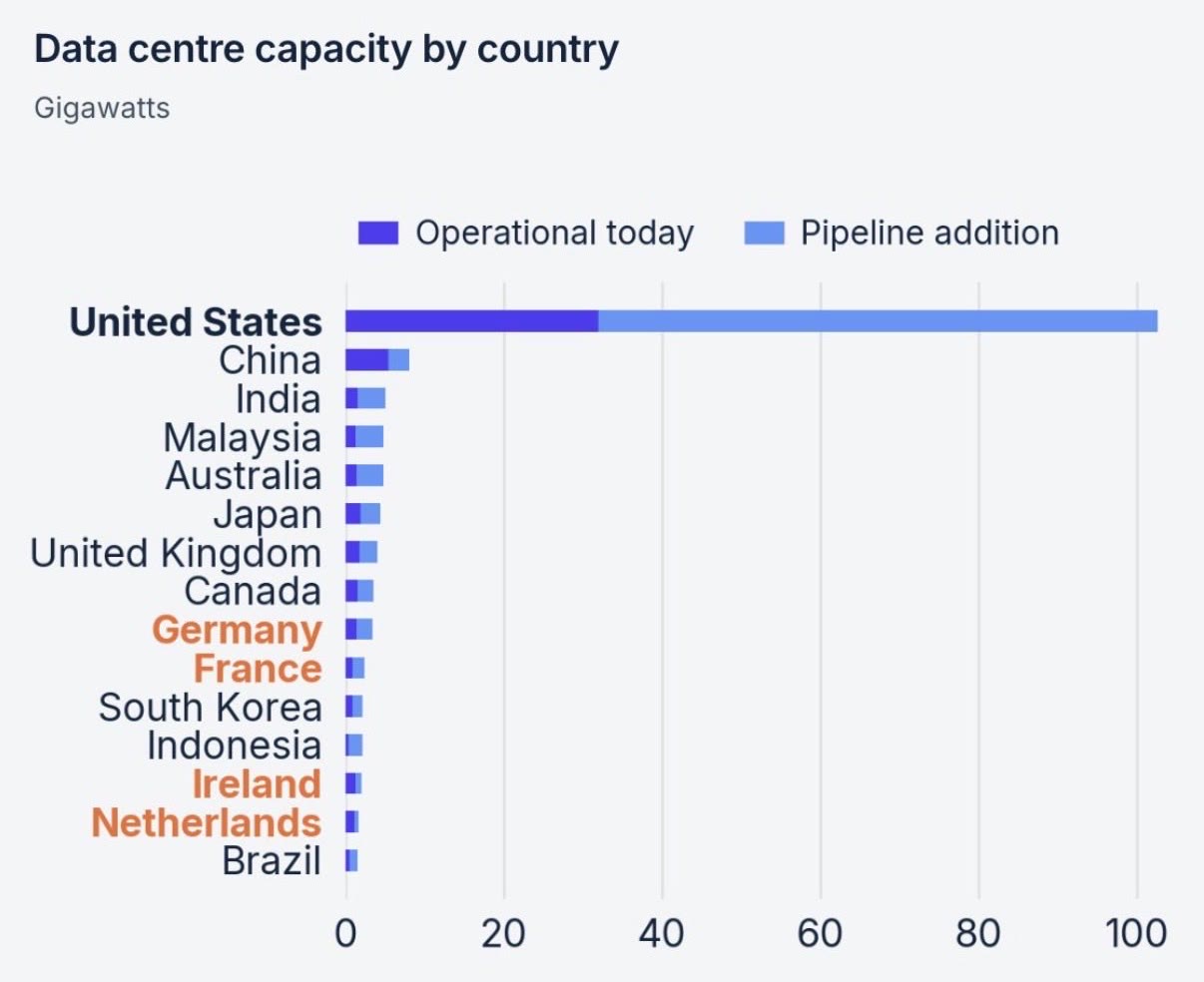 I'm treating these as rough figures: the bars have no printed values and neither the page nor Collison's post name a source or a date.
Models that don't write
Most AI models answer by writing text. Jev, from TypeSafe, doesn't: it's a decision model that answers a set of questions you prepare and scores how certain it is of each answer.
Spotlight now uses it to second-guess its own findings at three steps: the fact-check, the report draft, and what goes into your knowledge base. It asks things like:
- does the saved source fully support this finding?
- does the source state it, or only report someone's allegation?
- does this line overstate the finding?
- did it happen, or was it only announced?
It's opt-in and runs on your own OpenRouter key. I'll add an open-source decision model as an option in the coming weeks.
Proof at capture
As image generation blurs the line between fiction and reality, the industry is acting on provenance certification. Apple's new Reference Image mode has the iPhone 18 Pro's sensor sign each photo the moment it's taken, so it can be certified.
Systems built on the C2PA standard add provenance after capture. Apple's version signs the proof inside the sensor itself, which is a neat evolution.
Worth your time
Tools
🗂️ AI For Newsrooms — a directory of 1,086 newsroom AI projects and 132 editorial AI policies that you can search from your agent through a free MCP server.
📚 J·Index — 3,693 documented cases of newsroom AI use across 141 countries, including the controversies: fake AI bylines and undisclosed AI.
🎬 Tesseract — Mirage's free local engine lets an AI agent cut footage and build motion graphics as an editable project; it isn't open source.
📷 RAWmakase — an open-source Lightroom alternative for macOS and Linux that never modifies your originals; still a personal project in early development.
🌐 Atlas — World Labs' model rebuilds a scene from a few phone videos and renders camera angles nobody filmed, filling in what it "imagines" is out of view; early access only, and AMD agreed to buy World Labs on September 28 for about $8.2 billion.
Visual
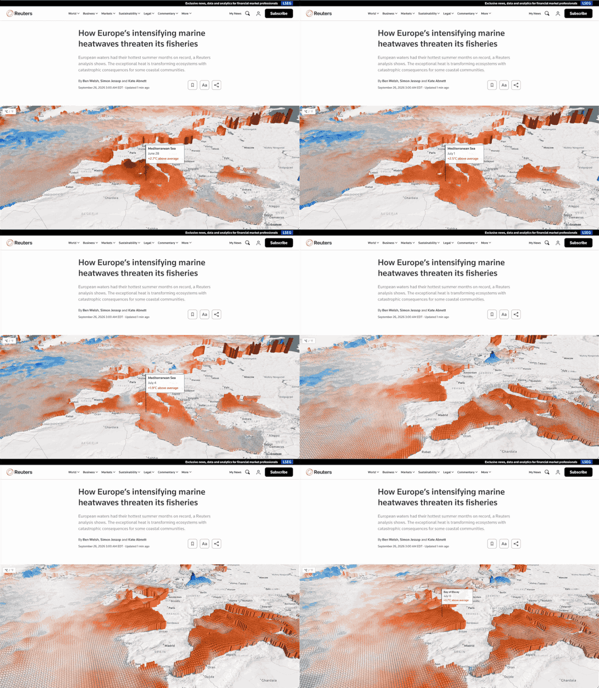
🌡️ How Europe's intensifying marine heatwaves threaten its fisheries — Reuters mapped this summer's sea heat in 3D. European seas averaged 21.6C, a 45-year high. Its reporters went to northern Spain, where kelp and lobster are disappearing, and to England's south coast, where octopus catches have soared.
Exit signal
The fantastic new report by David Caswell and Shuwei Fang, Signals at Scale, expects finished articles and videos to lose value as AI makes writing and summarising cheap. They call it an exploratory map. In their view, the things that gain value are the ones that stay scarce, like first-hand reporting and proof that information can be trusted.
They also flag the problem with that: "costly civic information may lack sufficient paying demand."
— Tom