Inspiration
A repository of data-driven visual stories from around the world, humanising complex issues with design and technology.

Illustration
Searching for Maura
Maura came to St. Louis from the Philippines to be put on display at the 1904 World’s Fair. Records suggest that, after her death, a Smithsonian anthropologist took part of her bra...
Illustration
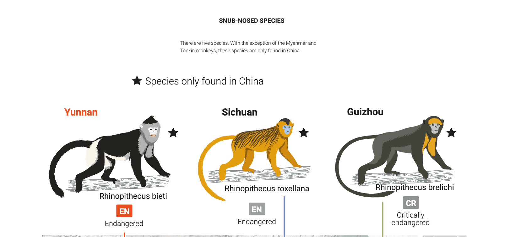
"Monochrome" monkey thrive in Yunnan
The Yunnan snub-nosed monkey is a type of golden monkey. In the 40 years since the Baima Snow Mountain Nature Reserve was established in Yunnan province, this black-and-white monke...
Inspiration of the Week
Multimedia
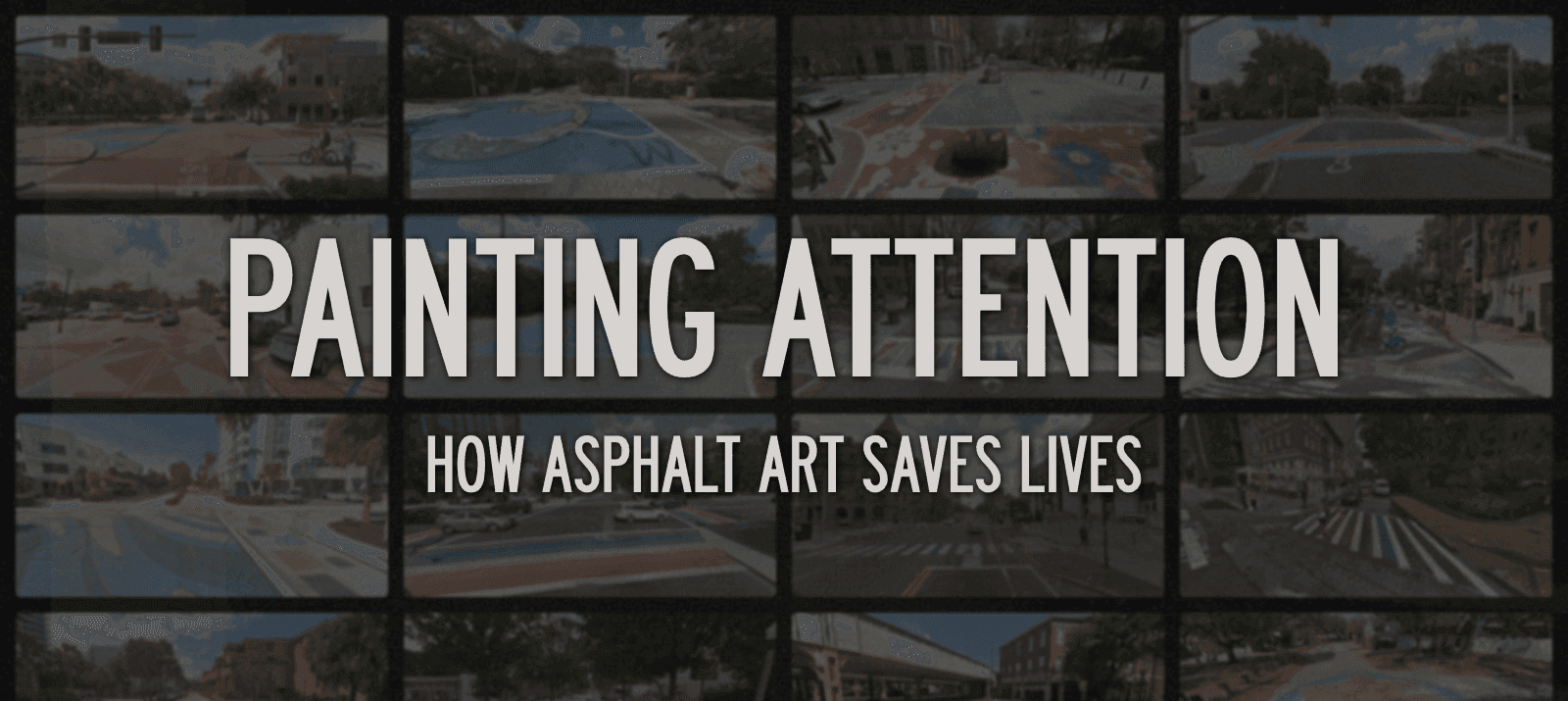
Painting Attention | How Asphalt Art Saves Lives
How asphalt art reduces accidents, improves roadway safety, and transforms communities.
Multimedia
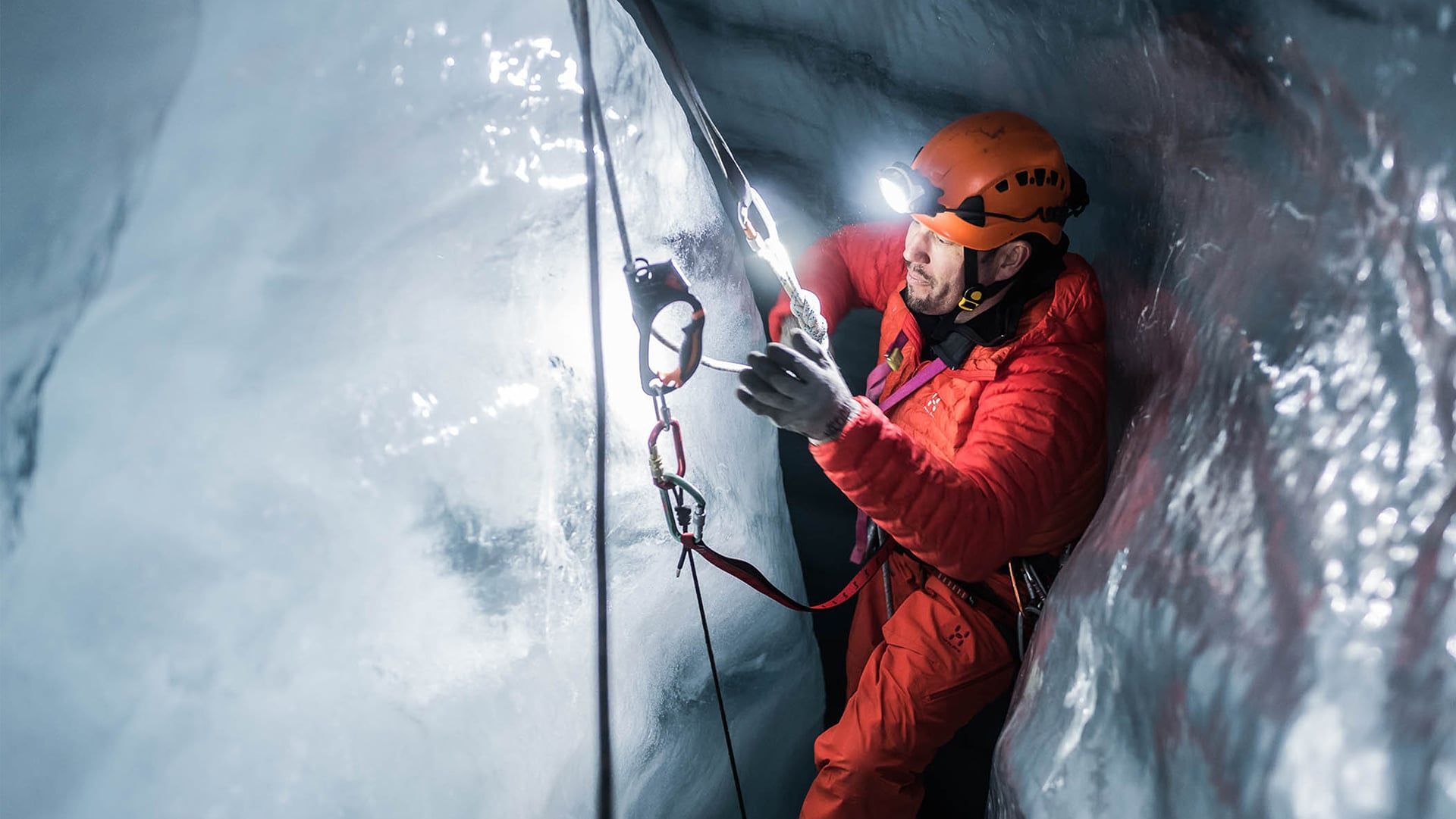
Into The Deep
The Plaine Morte Glacier is as untouched as its name suggests. But this winter a group of adventurers decided to go right to its heart. This in-depth exploration of what they disco...

The rise of anti-trans bills in the U.S.
How anti-trans bills in the U.S. restrict access to gender-affirming healthcare

Interactive
The Matrix Arcade
A Visual Explorable of Matrices and Linear Transformations
Illustration
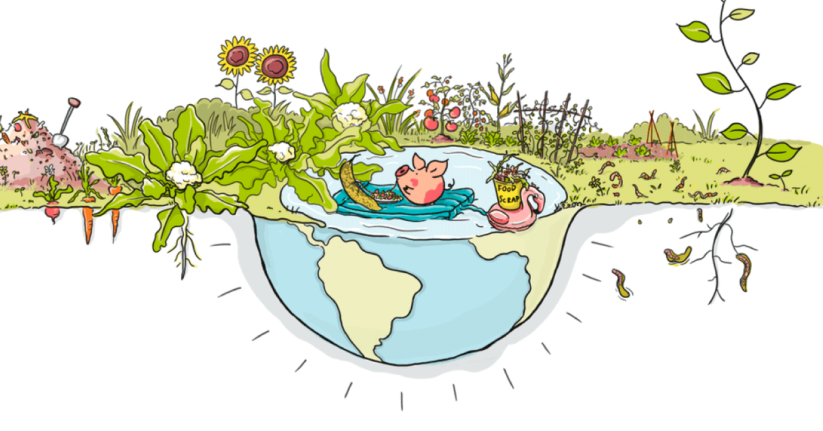
Don’t waste food
How every one of us can reduce greenhouse gases by keeping food out of landfills.

Cinematic
How England’s football league is breaking the sport
And why the rest of Europe can’t keep upUse code SEARCHPARTY at the link below to get an exclusive 60% off an annual Incogni plan: https://incogni.com/search...
Dataviz
Women are superstars on stage, but still rarely get to write songs
Songwriting credits since 1958, broken down by gender
Multimedia
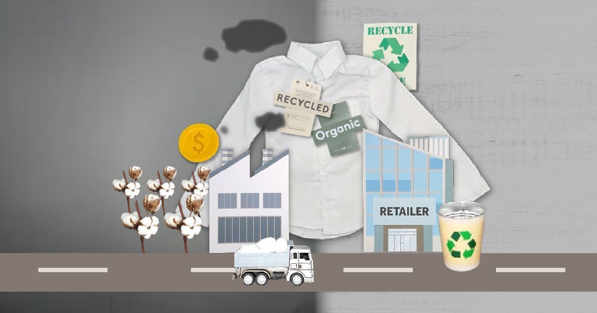
Going beyond the label: Is your eco-friendly shirt really green?
Fashion brands are claiming that their products are sustainable, but not enough of them are transparent about their supply chain. Here’s how a simple shirt is made - and how each s...
Multimedia
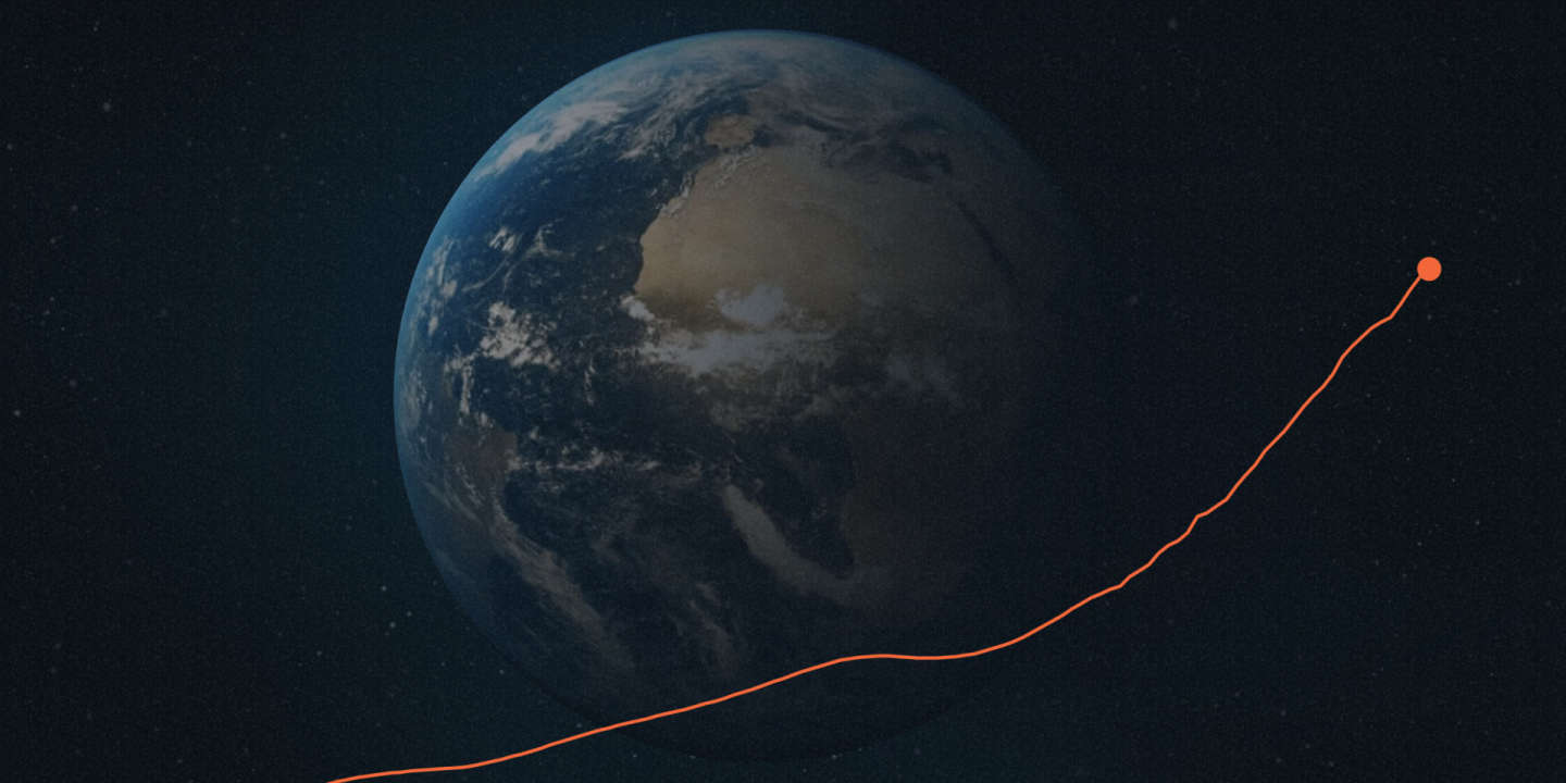
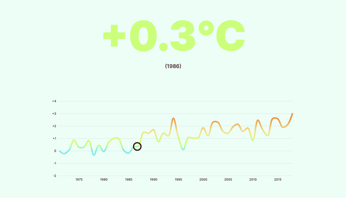
Comprendre le réchauffement climatique : comment nous avons bouleversé la planète
Deux siècles ont suffi à l’humanité pour dérégler le climat et enclencher une hausse des températures aux effets potentiellement dramatiques. Dans ce format visuel, « Le Monde » re...

Multimedia
Proud & Torn: A Visual Memoir of Hungarian History
“PROUD & TORN” is a story about a sister and brother born in Hungary in the 1930s, and previous generations of their family. Presented in a visual, interactive storytelling format ...

3D
한반도, 소리 없는 ‘위성 전쟁’… 머리 위 감시자들 | 한국일보
소리 없는 ‘위성 전쟁’… 758개 한반도 상공의 위성을 파헤쳐봤다

Interactive
The Structure of Stand-Up Comedy
The genius of Ali Wong’s Netflix special.
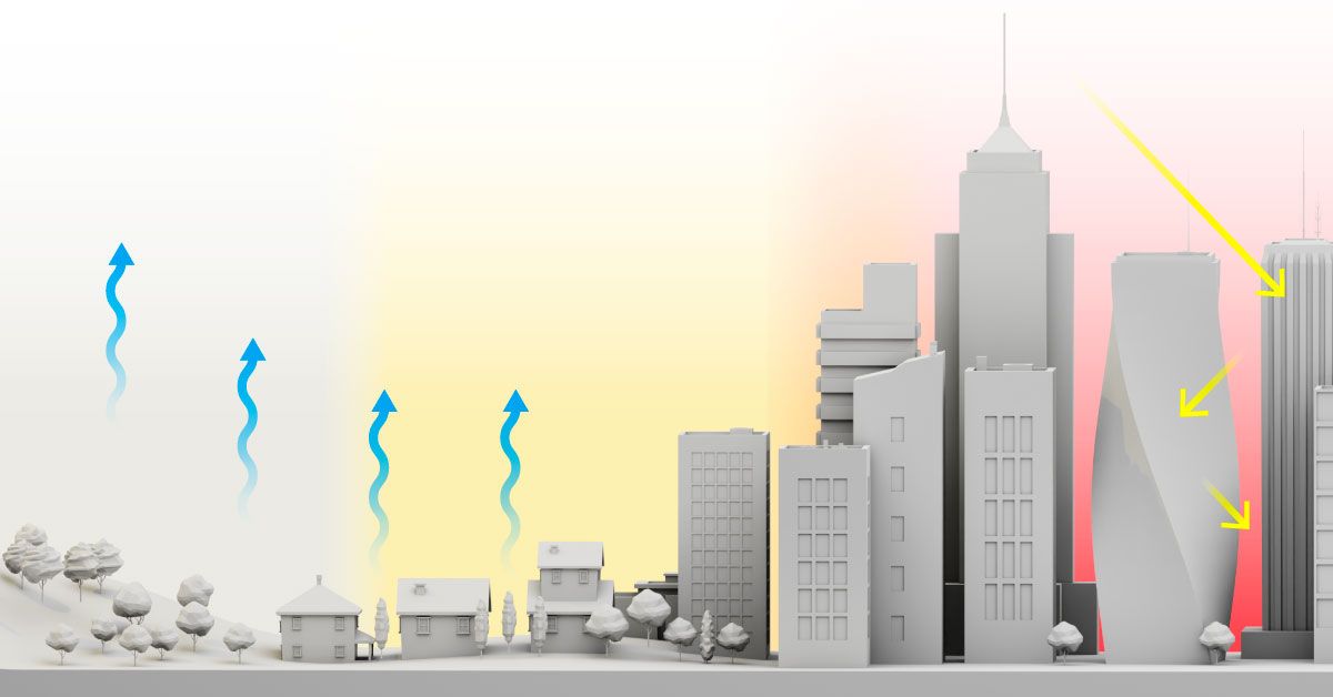
The floor is lava
How concrete, asphalt and urban heat islands add to the misery of heat waves

Multimedia
Generation Screwed
Why millennials are facing the scariest financial future of any generation since the Great Depression.

3D
AirPods Pro (2nd generation)
AirPods Pro (2nd generation). Richer audio quality, up to 2x more Active Noise Cancellation, Adaptive Transparency, and Personalized Spatial Audio.
Maps
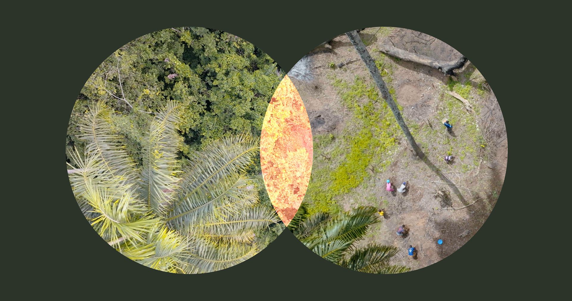
How Forest Loss Can Unleash the Next Pandemic
The forests around the epicenter of the world’s worst Ebola outbreak are getting patchier. The next pandemic could emerge from the edges around these patches, where wildlife and hu...

Interactive
Dataviz
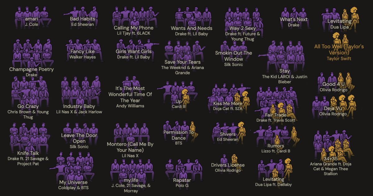
The unstoppable pop of Taylor Swift
A spin through what makes the record-breaking star so popular
Dataviz
Maps
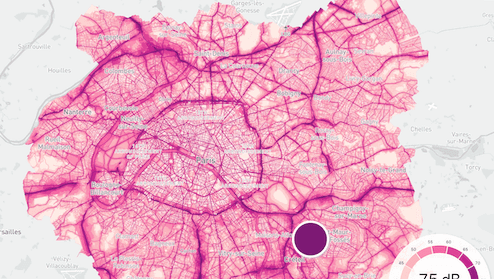
NOISY CITIES
Our noise maps show the levels of exposure to noise in London, Paris and New York. Use your mouse to explore the loudest and quietest spots in our Car Free Megacities.

Interactive
Where Is the Pass Going?
Few aspects of basketball capture the joy of the game like great passes. Can you see the court like the pros?
3D
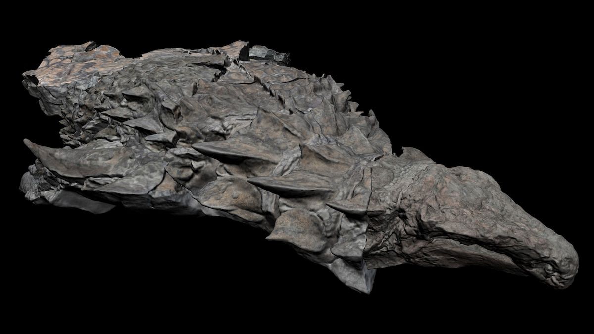
Exclusive: Experience the Best Dinosaur Fossil of Its Kind in 3-D
An ancient underwater burial yields one of the best dinosaur fossils ever discovered. Take an exclusive 3‑D tour of the find below.

Multimedia
If An A-Bomb Falls
Amidst the chaos and destruction of a-Bombs falling, hope flickers like a distant ember. The shattered remnants of civilization cling to resilience, banding together to navigate th...
Dataviz
Glocal Climate Change
The investigation was carried out by OBC Transeuropa for European Data Journalism Network (EDJNet) in 2020, as part of the network’s long-standing interest in environmental issues ...